


Mahjong for Low Vision: Readable Tiles, Lighting and Contrast
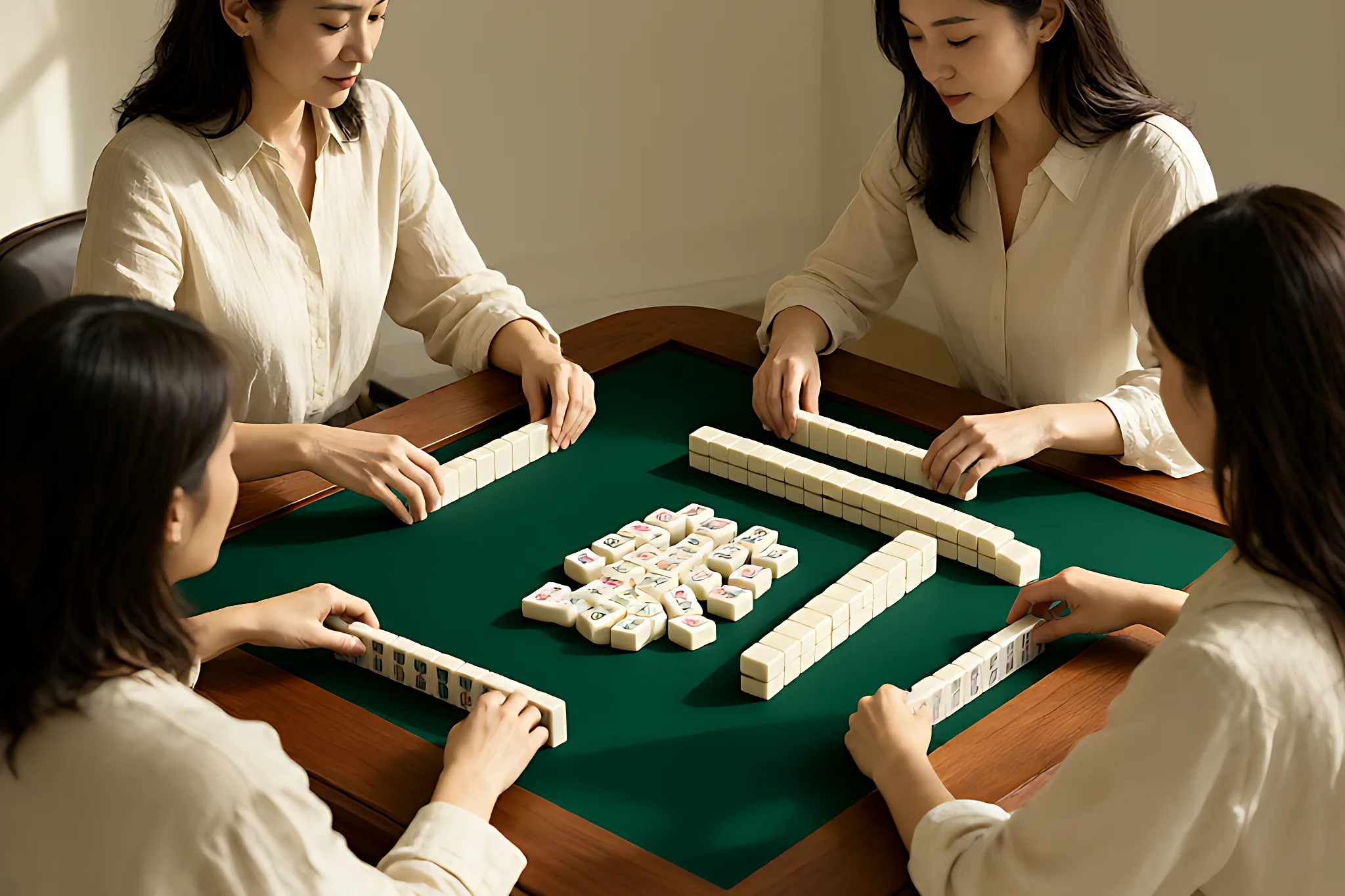
American mahjong asks the eye to do several jobs at once: recognize a suit, read a number or letter, distinguish a joker, scan a rack of tiles and follow the card. In a well-lit room with a familiar set, those tasks can feel automatic. In a dim room, under a glossy light, across a wide table or with changing vision, the same game can become tiring and stressful.
Low vision is not one condition, and there is no single “best” set for every player. The useful goal is to reduce unnecessary visual and physical effort. Contrast, glare, tile size, font clarity, lighting, table color, rack design and the way each player organizes a hand all affect how easy the game feels. Improving several small details usually works better than changing one object and hoping the whole table becomes comfortable.
This guide is written for older players, people with changing vision, hosts preparing a game for mixed ages and anyone who wants a calmer table. It is not medical advice. If vision has changed suddenly or noticeably, speak with an eye-care professional. At the table, simple environmental changes can still make a meaningful difference.
Start with the four tasks that actually strain the eye
Before buying anything, watch a normal round. A player needs to read their own tiles, read the shared card, identify discarded tiles and follow the center of the table. These tasks happen at different distances and angles, so a solution that helps one may not help another.
Reading a hand is close work. Reading a card may require looking slightly to the side. Discards and walls are farther away and often seen at an angle. A set that looks beautiful in a close-up photograph may still be difficult when the player has to recognize a small number across a 36-inch table. Good table design supports all four tasks, not only the tiles in a hand.
Contrast matters more than pure brightness
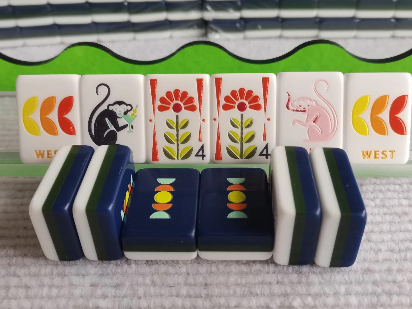
The first instinct is often to make everything brighter. Brightness helps, but contrast determines whether an edge or symbol is distinguishable. White numerals on a pale ivory face can disappear even in a bright room. Soft gray artwork on a dark blue back can blur when the tile is viewed at an angle. Strong contrast between the symbol and face, and between the tile and table surface, is more useful than a uniformly bright scene.
Look at a tile from the player’s normal distance. Is the number visible before the decorative art? Do the suit marks separate cleanly from the background? Can a joker be recognized without studying every detail? High contrast does not mean harsh black-and-white design. It means each important element has a clear edge and a distinct value.
Many players find that warm ivory faces with dark line work are easier to read than highly reflective pure white faces. Others prefer a bright white face with strong dark engraving. The right choice depends on lighting and individual vision, so compare tiles in the room where you actually play.
Tile size and stroke weight both matter
A larger face gives the designer more room, but size alone does not guarantee readability. A big tile with thin pale lines can be harder to read than a slightly smaller tile with bold symbols and clear spacing. Stroke weight, negative space and the distance between suit marks matter just as much as the overall face height.
For many players, a modern American tile around the size of 31.5 × 23 mm on the face is a comfortable starting point. Our current Pink American Mahjong Tiles and Green American Mahjong Tiles use that approximate face size with distinct illustrated designs. A larger option is not automatically better if the artwork is crowded. Ask whether the numbers and suit markers remain obvious when the decorative detail becomes secondary.
If you already own a set, print a simple test sheet with the same tile face at several sizes and view it at your normal table distance. This does not reproduce engraving or material, but it helps you judge how much detail you can comfortably separate. For a more detailed discussion of dimensions, see our mahjong tile size guide.
Control glare before adding more light
Glare can erase contrast. A glossy tile face catches a ceiling fixture and turns part of the design into a white glare patch. A shiny table surface reflects the window behind the player. Even a bright room can feel difficult if light is bouncing directly into the eye or across the tile faces.
Move lamps out of the direct line of sight. Use a shade or diffuser instead of an exposed bulb. Angle a light slightly from the side rather than straight down onto a glossy tile. If a window is producing glare, close a sheer curtain or turn the table so the window is not directly behind the player’s sight line. The goal is soft, even illumination with no bright reflection on the tile face.
Tile finish changes the result. Matte or satin finishes reduce mirror-like reflections; high-gloss surfaces show every light source. Our article on tile backs, color and glare explains why a tile can look clear in one room and disappear in another.
Light the table evenly, not only the room
A room can feel bright while the table remains in shadow. A ceiling light behind the player can cast a shadow over the hand; a decorative lamp may light the wall but leave the discard area dim. Check the actual table from each seat. Ask each player whether their own rack, the center and the shared card are easy to see.
A floor lamp placed to the side, a table lamp with a diffusing shade or a dimmable overhead light may work better than a single bright fixture. Avoid placing a light directly behind the player’s head, because it can create glare on the tiles in front of them. If the table is used at night, test with the same lamps you will use during a game, not under daylight.
Light temperature also changes contrast. Very cool light can make ivory tiles look blue-white; warm light can make pink and coral designs blend into the face. Neutral or slightly warm white light is usually a practical starting point. Choose a bulb with a high color-rendering index if the package provides it, so tile colors remain distinguishable.
Use the mat as a contrast tool
The table surface is part of the visual system. A white tile on a white cloth has a weak edge; a pale pink tile on a beige table can lose its shape. A deep green, charcoal or muted navy mat gives many ivory tiles a clear silhouette while still fitting a warm room. The mat should reduce reflection and provide a stable surface for racks and pushers.
Mat texture matters as well. A matte, slightly textured surface helps prevent glare and softens the sound of tiles. It should not be so busy that the pattern competes with the tile faces. Solid colors usually work better for visual clarity than large decorative prints. Our guide to choosing a mahjong mat covers size, grip and noise.
Check the color contrast in the actual room. A mat that looks dark online may become a reflective medium gray under a bright lamp. A dark mat can also make black or navy tile backs disappear. Compare both the face and the back of the tile against the mat, not only the front design.
Choose racks and pushers that reduce handling effort
Visual accessibility is connected to hand comfort. A rack that is too short forces a player to re-stack constantly. A narrow rail makes tiles tilt or stick. A pusher that is too small for the rack requires extra grip and makes it harder to move a full wall of tiles. These small frustrations increase fatigue and distract from reading the game.
Use a rack long enough for the usual hand and deep enough for the tile thickness. Check that the pusher moves smoothly without scraping the tile edges. A matte rack can reduce glare under a lamp, and a color that contrasts with the tiles makes the hand edge easier to see. If several players have different needs, choose a rack that is comfortable for the smallest hand and the largest tile.
Our guide to matching a rack to your tile size explains how to measure the opening and stack length. Do not assume every “standard” rack fits every “standard” tile. A quick measurement at home is more reliable than a product category name.
Organize the hand and discards for easier scanning
A player’s hand becomes harder to read when tiles are crowded, tilted or constantly changing position. Keep the rack organized by suit or by planned groups, and use the same order each game. Leave a little space between groups if the rack allows it. A clear arrangement reduces the amount of visual searching needed on every turn.
Discards also benefit from a consistent layout. If each player drops tiles at random, the center becomes a visual puzzle. Keep the discard area inside a defined part of the mat and turn the most relevant symbols toward the table when practical. The goal is not to create a new rule; it is to make the shared information easier to scan. Our guide to reading mahjong tiles explains suit and symbol structure, which can help newer players follow the table.
Make the shared card easier to use
The card is often the smallest text on the table. Place it where every player can see it without leaning into someone else’s space. A simple stand can raise the card and reduce glare; a larger printed copy or a well-lit card holder may help a player who struggles with the original size. Check the rules and current card format for your game before making a modified copy.
If several players need to share one card, position it at the center or use two cards when the game format allows. Avoid placing a drink or a phone on top of the card. The card should be treated as part of the play area, not a decorative item that moves around the table.
Compare a new set in the room where you play
A showroom, a photograph and a dim dining room are three different viewing environments. If possible, bring two or three tiles home and look at them under your usual lamp. View them from each seat and at the distance you normally use. Compare the numbers, the suit marks, the joker faces and the tile back against your mat.
If you cannot see a set in person, ask the seller for a clear photograph taken under neutral light and without heavy editing. The image should show a full face and the side profile, not only a decorative close-up. Our guide to melamine versus acrylic can help you understand how material affects the surface, and our guide to engraved versus UV-printed finishes explains why some designs stay clearer than others.
A practical setup checklist
- Give each player a rack and pusher that fit the tile comfortably.
- Use a solid matte mat that contrasts with both tile faces and backs.
- Remove direct glare from lamps, windows and glossy table surfaces.
- Light the card, racks and center separately from the rest of the room.
- Keep the hand organized in the same order each game.
- Place the card where everyone can see it without leaning.
- Choose tiles with clear numbers, strong suit marks and uncluttered joker faces.
- Avoid relying on size alone; stroke weight and contrast matter too.
- Test one change at a time and ask each player what actually helped.
What to change first
If you want to improve a table without buying a new set, start with lighting and glare. Move the lamp, diffuse the light, turn the table away from a window and add a matte mat. These changes cost little and affect every tile. Next, check the racks and the card position. Only then consider new tiles.
If you are buying a set for a group with mixed vision, choose a clear design rather than the most detailed illustration. Look at the face from across the table, not only in a close-up. A set with 31.5 × 23 mm faces can be very readable when the contrast and spacing are good; a larger set can still fail if the artwork is crowded or the surface glares.
Accessibility is not a separate style. It is good table design: clear edges, controlled light, comfortable tools and less unnecessary searching. A small change that lets every player relax and follow the game is more valuable than an impressive object that creates visual strain. Browse the American mahjong tile collection when you are ready to compare designs.
Frequently asked questions
What makes mahjong tiles easiest to read?
Strong contrast between the symbol and the face, clear spacing, readable numbers and a finish that does not produce glare are more important than size alone.
Are large-print mahjong tiles better for older players?
Sometimes, but not always. A larger face can help, yet a smaller tile with bolder lines and better contrast may be easier to read than a large tile with crowded artwork.
What color mat is best for low vision?
A solid matte color that contrasts with the tiles is usually best. Deep green, charcoal or muted navy can work well with ivory faces, but the best choice depends on the tile backs and the room light.
Should I replace the tiles or change the lighting first?
Start with lighting and glare because they affect every part of the table. If the tiles are still difficult to read after those changes, compare designs in your normal playing light.
How can I make the shared card easier to see?
Use a stand, position it where everyone can see it, remove glare and consider a larger copy if the game format allows. Keep the card clear of drinks and other objects.
Can a pusher help a player with limited hand strength?
A well-matched pusher can reduce the need to move individual tiles and make the turn less tiring. Check that it fits the rack and moves smoothly without scraping.