


Themed Mahjong Tiles: How to Pick a Design You'll Actually Love
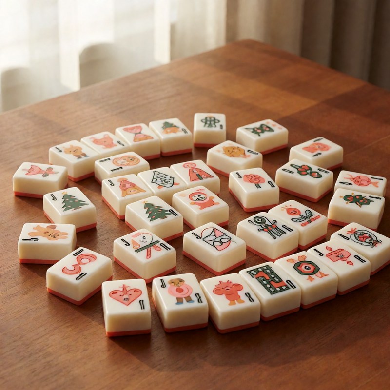
A themed mahjong set is a small bet on taste. You will stare at these tiles for hours at a time, so the question is not whether the theme is cute in the photo. It is whether the design still looks right when the tiles are spread on a table, mixed with racks and a mat, and glanced at from three feet away.
Read the design at arm's length
The tile faces are only an inch or so tall, and the artwork shrinks fast. A design with a lot of tiny detail can turn into a blur of color once the wall is built. The best themed sets keep one clear motif on each suit, with the suit name and number still easy to spot. If you have to squint at a product photo to tell a bam from a crack, that problem gets worse in play.
Match the theme to the table, not just the photo
Think about where the set will actually live. A bright summer or coastal design sits comfortably on a light mat and reads well in a sunroom. A darker marbled or porcelain-style set looks sharper on a solid, darker surface. The theme does not have to match the room, but it should not fight the mat and the racks for attention. Pick a palette that leaves the center of the table quiet enough to read.
Choose a design that ages
Novelty themes are fun, but ask yourself whether the joke still lands after the holiday is over. A bee or lemon or mermaid theme is specific without being tied to one weekend, so it stays wearable all year. A Christmas set is a joy in December and a lot of red and green in July. Neither is wrong; just know which one you are buying.
Let the material carry the color
The same design prints differently on melamine and acrylic. Engraved melamine gives a flatter, matte look that holds up to water and handling. Acrylic with UV printing gives sharper, brighter color but shows scratches more easily. If the design leans on fine lines or gradients, check how it looks on the material you are actually ordering, not a different listing with the same theme.
Before you commit, open a few sets side by side and ask one question: could I read this wall from across the table? See the Mahjong Sets & Tiles category for the current themed sets, with melamine and acrylic options.
Choose a theme that survives the first impression
The strongest themed tile design is not always the busiest one. Stand back from the sample image and judge whether the suits and numbers remain readable at table distance. A holiday design can be perfect for a seasonal gathering, while a floral or geometric pattern may be easier to live with throughout the year. Consider the room, the mat and the storage case as part of the same visual decision.
For a gift, choose a theme connected to the recipient rather than a generic seasonal motif. Confirm their tile size and joker preferences if they already own a set. Read Mahjong Tile Sizes, Materials & Styles and browse the American mahjong tile collection for comparable designs.
A design-selection checklist
View the tile design at thumbnail size, normal screen size and close up. At each distance, ask whether the suits, numbers, winds and jokers remain recognisable. Then imagine the design under the lighting in your room. A dark tile with fine detail can be difficult at night; a very bright tile may create glare.
Choose a theme that fits more than one occasion if the set will be used often. A holiday design can be a wonderful seasonal purchase, while a floral, geometric or coastal pattern may suit weekly play. Confirm the tile count, construction and joker details before falling in love with the artwork.
Use the thumbnail test
Reduce the product image to a small thumbnail and ask whether the design still has a clear focus. Then view it at normal size and read the suits, numbers and jokers. A theme that works at both distances is easier to live with than one that only looks good in a close-up.
Consider the room, mat and storage as a set. A bold tile design may need quieter accessories, while a delicate pattern can disappear beside a busy tablecloth.
Compare two designs under the same light
Open two product images on the same screen and compare the suits, backs and joker artwork under one lighting condition. This makes it easier to notice whether one design is calmer, more detailed or easier to read. Then place the preferred image beside a photograph of your room and mat before deciding.
Write down the practical reason for the choice: readability, occasion, gift recipient or color. A reason beyond “looks nice” helps confirm the decision later.